OVERVIEW
Museum of Self is an immersive web-based concept that blends motion design, branding, and experience design to explore self-perception. Created with Rachel Babin and I-wen Whang, the project presents a quiz that inverts personality test results, encouraging reflection through contrast. Minimalist visuals, abstract animations, and a refined brand system combine to create an introspective and aesthetically engaging digital experience for a tech-savvy audience.
Concept
In collaboration with Rachel Babin and I-wen Whang, we developed an interactive web experience that takes the familiar format of a personality quiz but subverts expectations. Instead of reinforcing the participant’s self-perception, the quiz generates the opposite personality type based on their answers, challenging users to reflect on how they respond to conflicting identities.
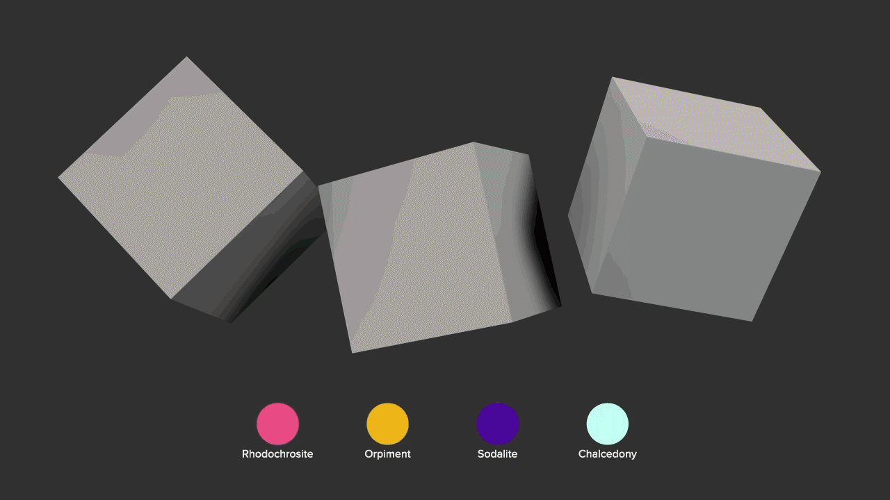
For my exhibit, this contrast highlighted logical thinkers as a reflection of emotion-based decision-makers. Featuring the options to select from three geometric shapes, four colors, and four textures resulting in a quiz with 48 different possible personality test results. The quiz was powered through some JavaScript code, HTML, and a lot of gif files.
Process
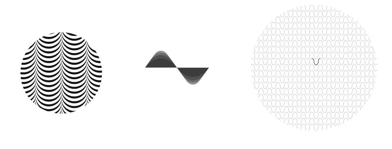
The experience was structured through three layers of abstract, intentionally ambiguous questions designed to prevent users from easily choosing a predetermined outcome. Each selection triggered responsive animations rendered in Cinema 4D using primitive shapes, lighting, and textures. By keeping the design minimalist, the quiz maintained both visual clarity and efficient file size while delivering an immersive, reactive experience.
Problem?
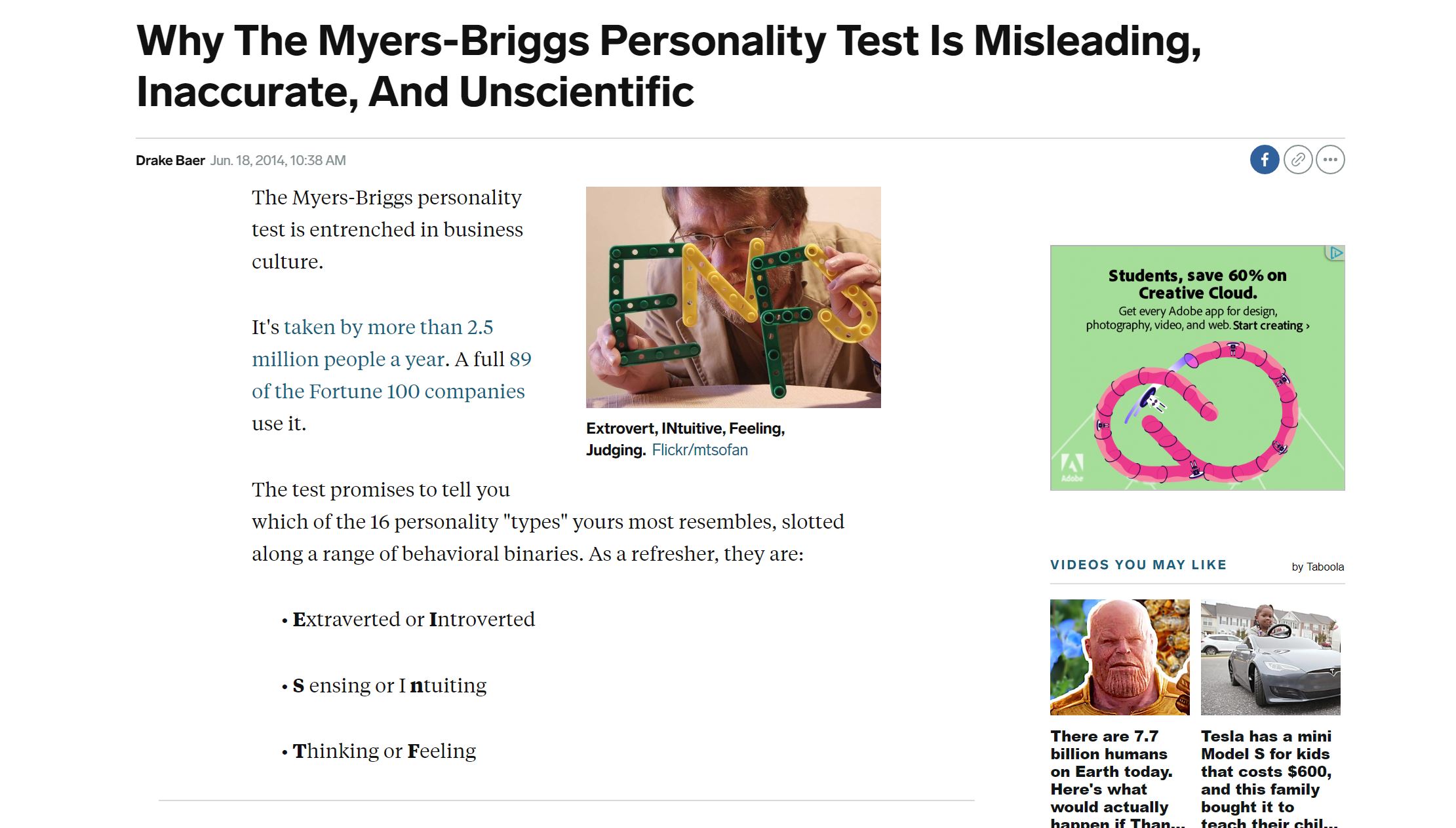
Traditional online personality tests often feel predictable, offering generic questions and outcomes that resemble “choose your own adventure” pathways. Museum of Self sought to break away from these limitations by embracing abstraction, crafting unique question structures, and enhancing the experience with immersive, dynamic visuals.
Persona
Name: Chris Smith
Gender: Male
Age: 24
Occupation: Developer
Hobbies: Attending festivals, exploring food culture, drinking boba, and browsing the web.

Target Market
The project was designed for a tech-savvy audience ranging from teenagers to adults in their mid-thirties, individuals drawn to digital experiences that encourage self-reflection and personal insight.
Initial Sketches
Early explorations centered on themes of introspection and self-actualization, with visual inspiration drawn from the organic structures of brain cells. The design direction aimed to balance psychedelic aesthetics with a subtle and simplified execution.
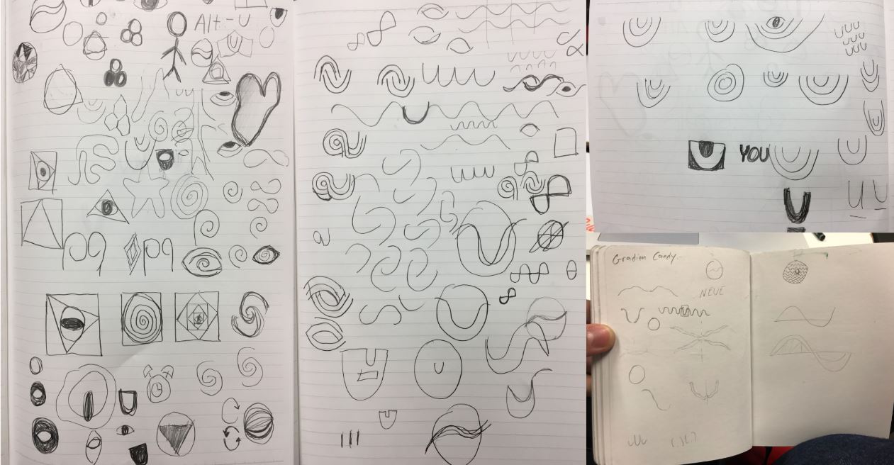
Logo Ideation
The initial logo explorations focused on the letter “U” as a direct symbol of the self and its connection to the viewer. Symmetry, rounded forms, and fluidity were emphasized to support the idea of psychedelic motion graphics while keeping the design approachable.
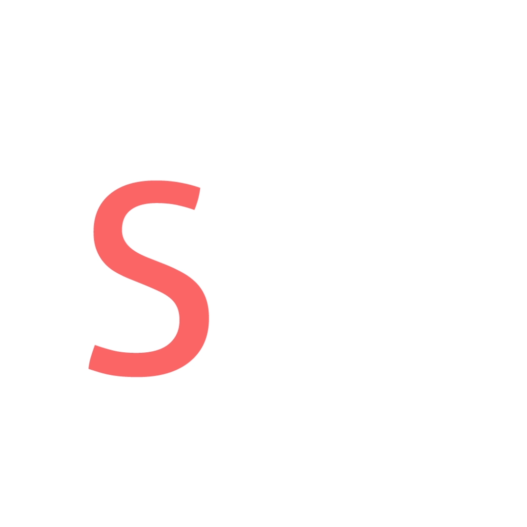
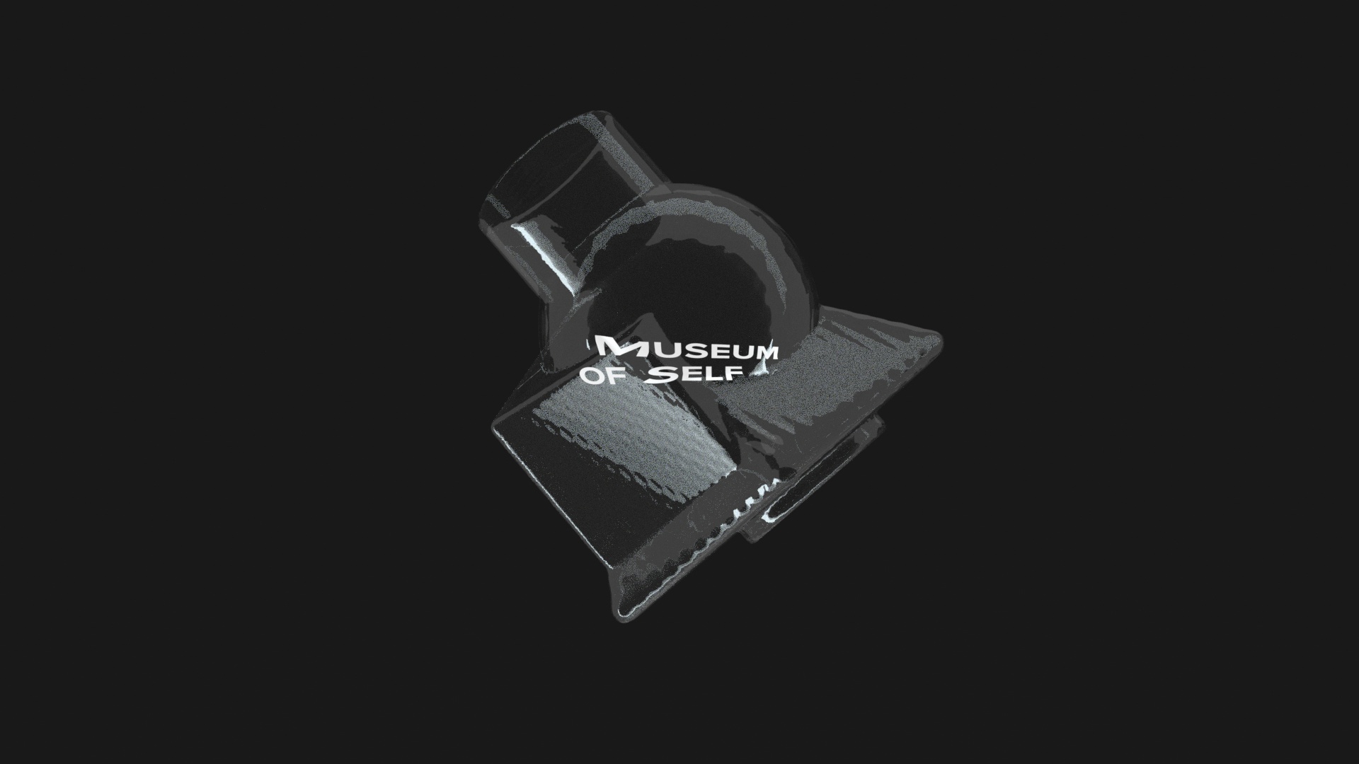
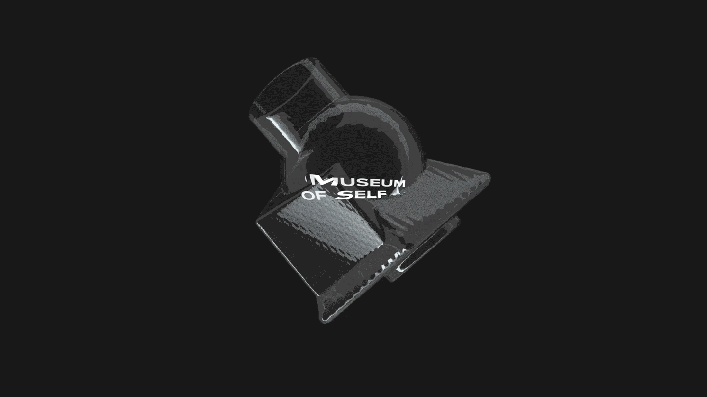
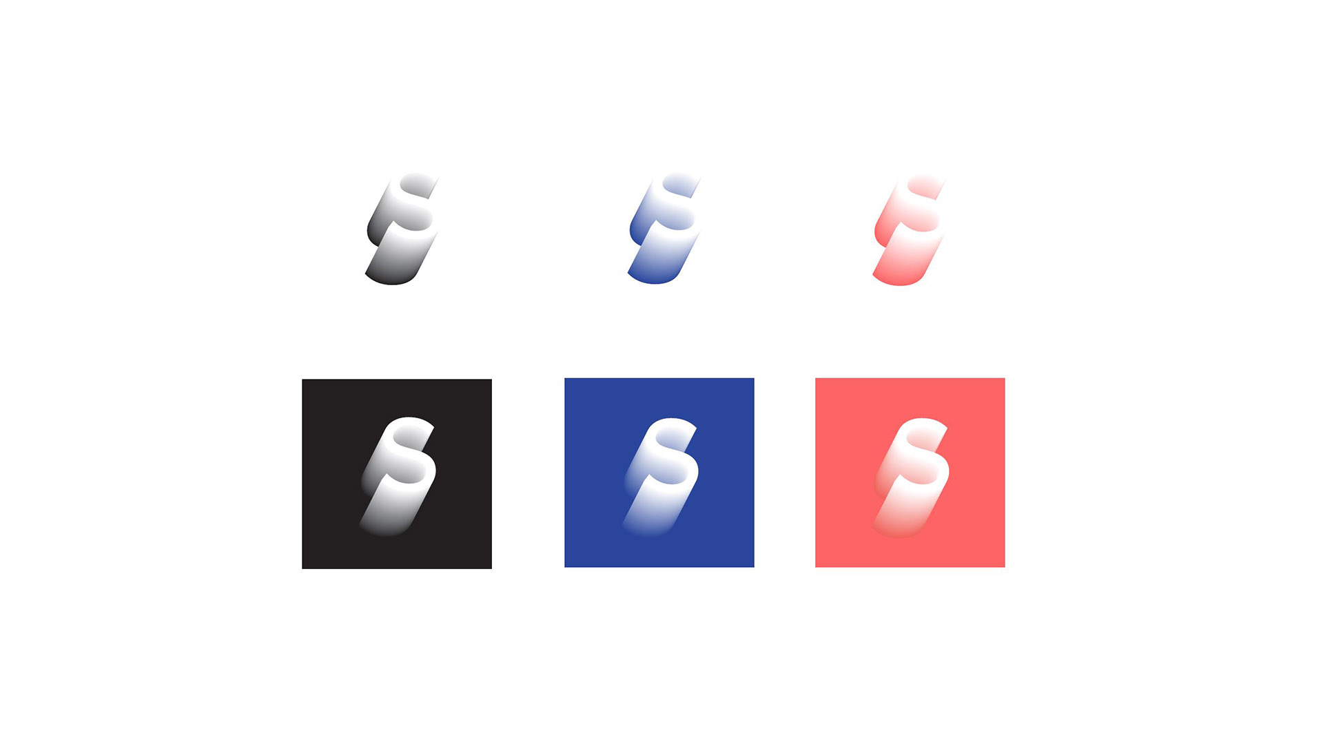
Final Logo
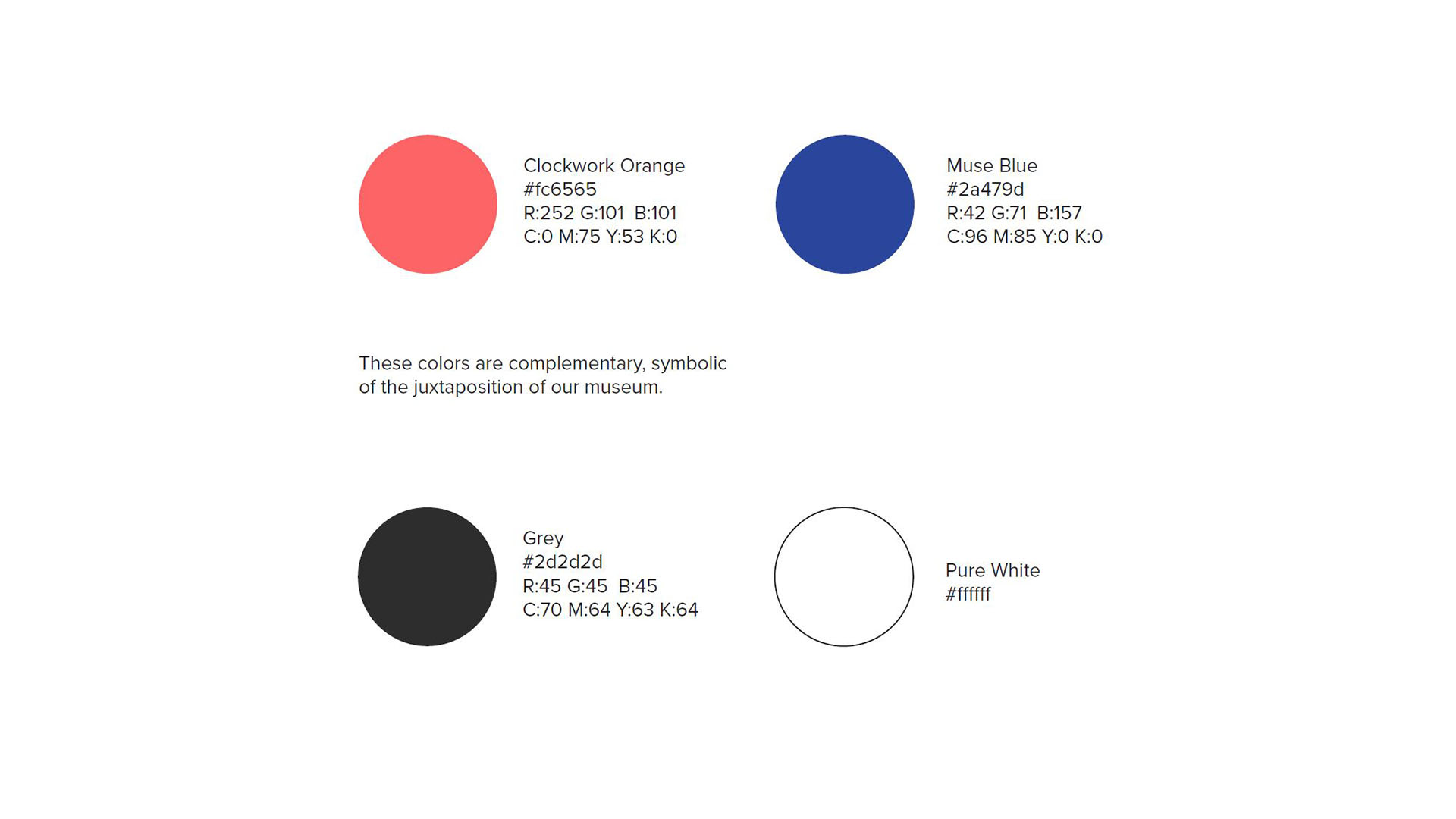
Ultimately, we pivoted to an extruded “S” set in Proxima Nova, representing the self across three dimensions—one for each exhibit layer. Gradient coloring was introduced to symbolize depth, realization, and transformation.

Color Variants
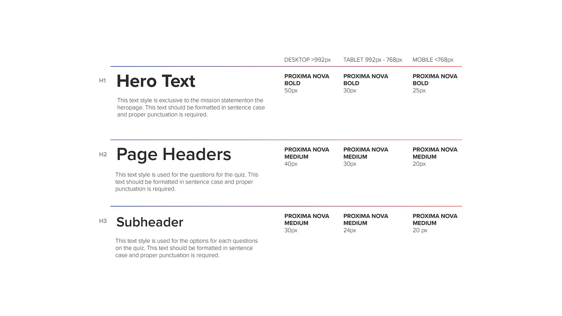
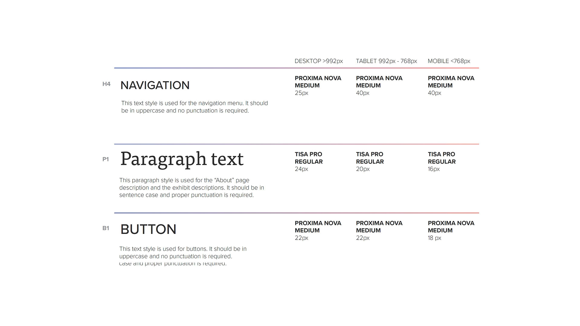
Type Use
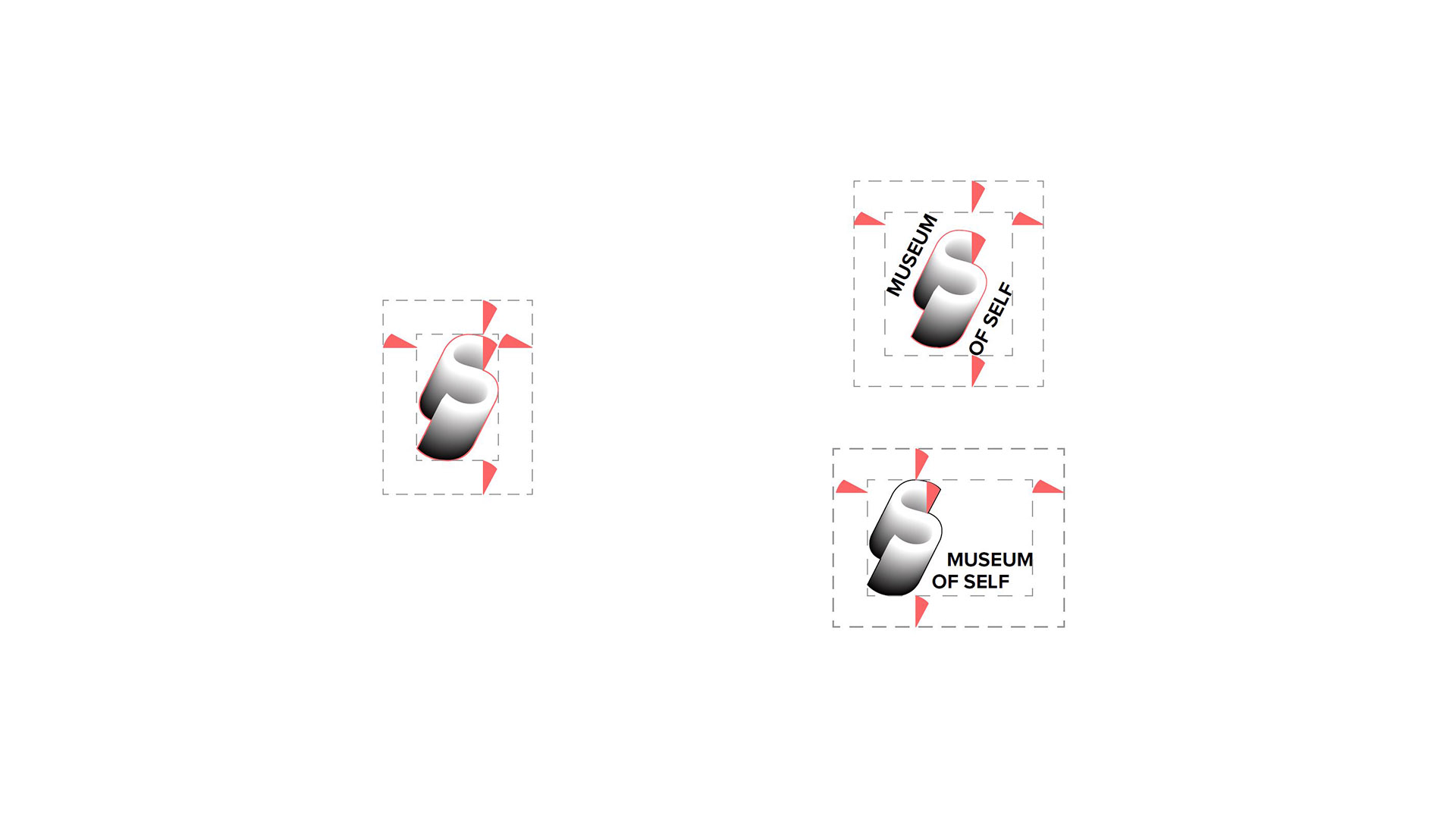
Logo Clear Spacing
The signature “S” maintains its clear space using the angled cut of its tail as a consistent guiding unit.
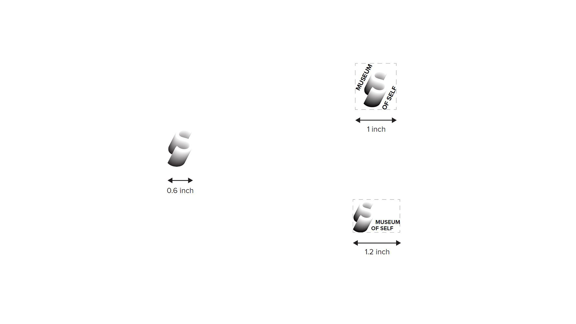
Minimum Sizing
• Signature “S” should not be reduced smaller than 0.6 inches.
• Diagonal lock-up should not appear smaller than 1 inch.
• Horizontal lock-up should not appear smaller than 1.2 inches.
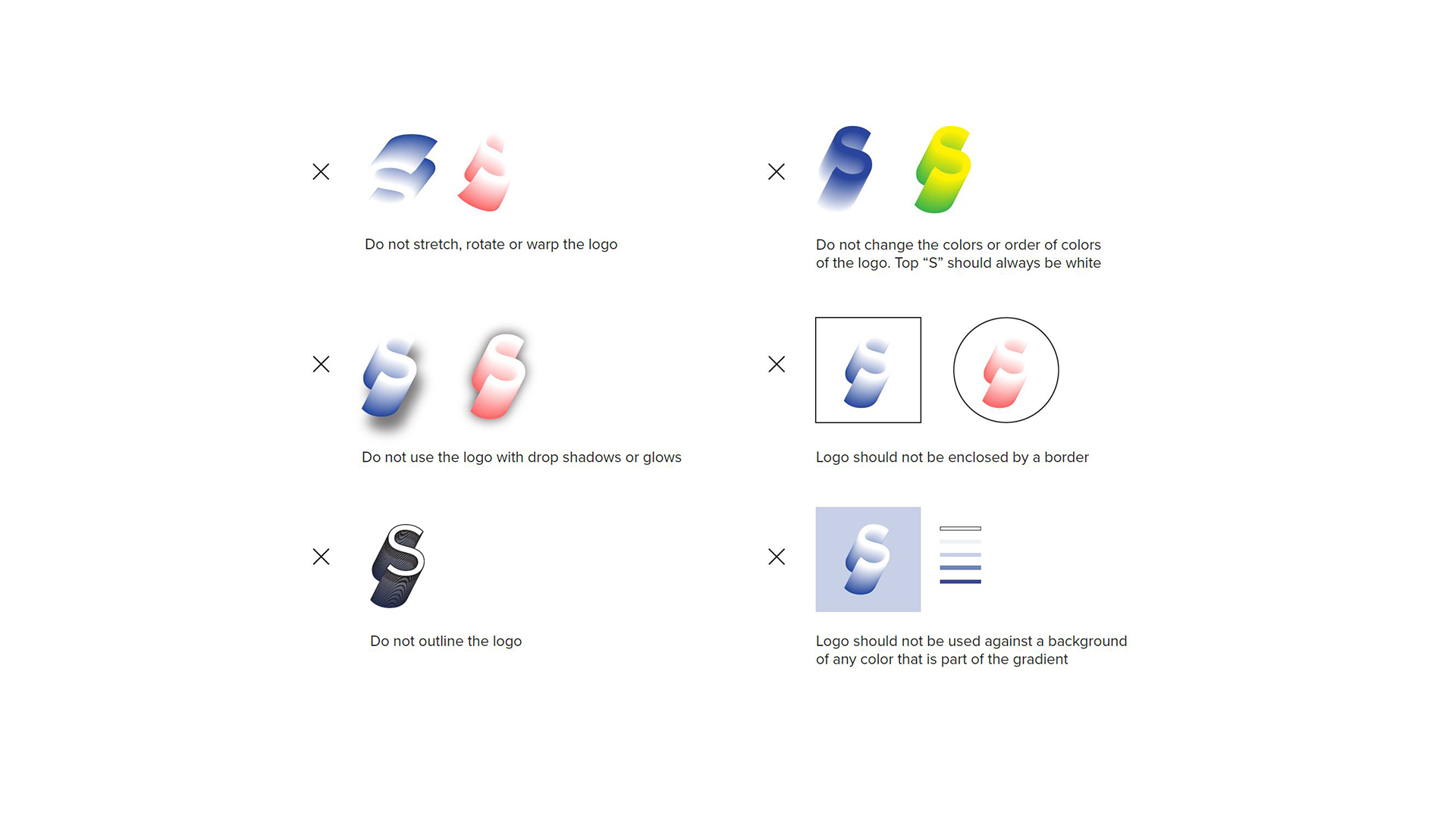
Forbidden Logo Use
• Do not stretch, warp, or distort.
• No drop shadows, glows, or outlines.
• The “S” cap must always remain white.
• The logo should never be placed within a border.
• The “S” should not appear against a background that matches its primary color.